Introduction
Outdoor gear is not only expensive, but it's also highly personalized. Enthusiasts frequently swap out or upgrade their equipment, which can lead to an accumulation of unused gear in their garages and closets.
While there are marketplaces that people can use to buy and sell used gear, they are all lacking in one or more areas that could make them the preferred platform for outdoor enthusiasts. After reading comments on various online forums and speaking with friends and acquaintances about the issue, it’s clear that there is a market for quality used gear. What’s missing is a reliable platform that is dedicated to the outdoor market and gives both the buyer and seller the opportunity to make the best deal possible while fostering a sense of community.
Out of these observations came the idea for GearSwap, an app dedicated to the used outdoor gear market that connects buyers and sellers and fosters win-win transactions.
The Problem
Outdoor enthusiasts often accumulate high-quality gear that goes unused as they upgrade or replace their equipment. This presents a challenge because while quality gear is expensive, many individuals prefer to purchase gently used gear to save money and support sustainability. However, the current process of selling used gear is seen as cumbersome and unreliable, leading people to hold onto their gear rather than resell it. This creates a missed opportunity, both for sellers to recoup value and for buyers to access affordable, sustainable options.
Understanding The User
Having identified a gap in the pre-owned outdoor gear market, I started working to define and plan the app in more detail. To accomplish this, I chose a few different tools that would help me to better understand our user base and their needs:
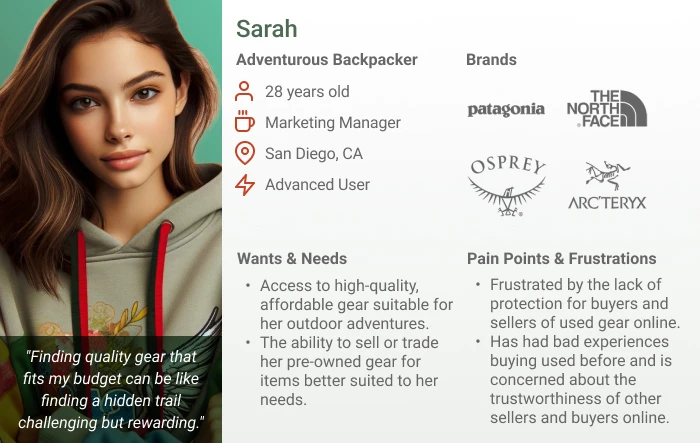
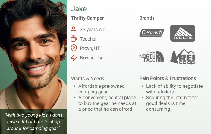
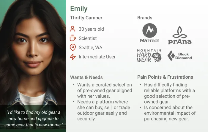
Personas
Based on the findings of my competitive analysis and the user stories, I created a persona for three types of users who are likely to use an app such as GearSwap that allows for the exchange of used outdoor gear.
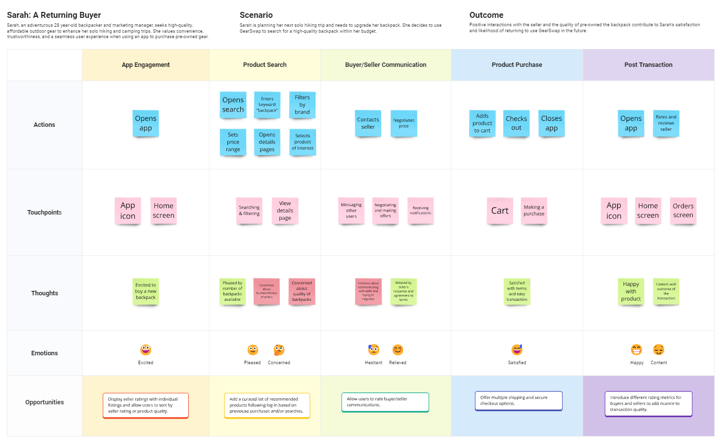
Journey Maps
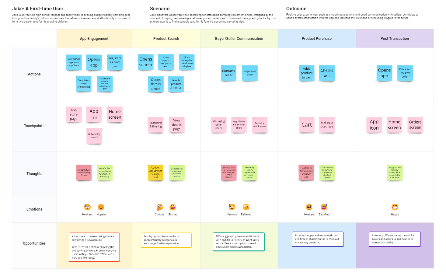
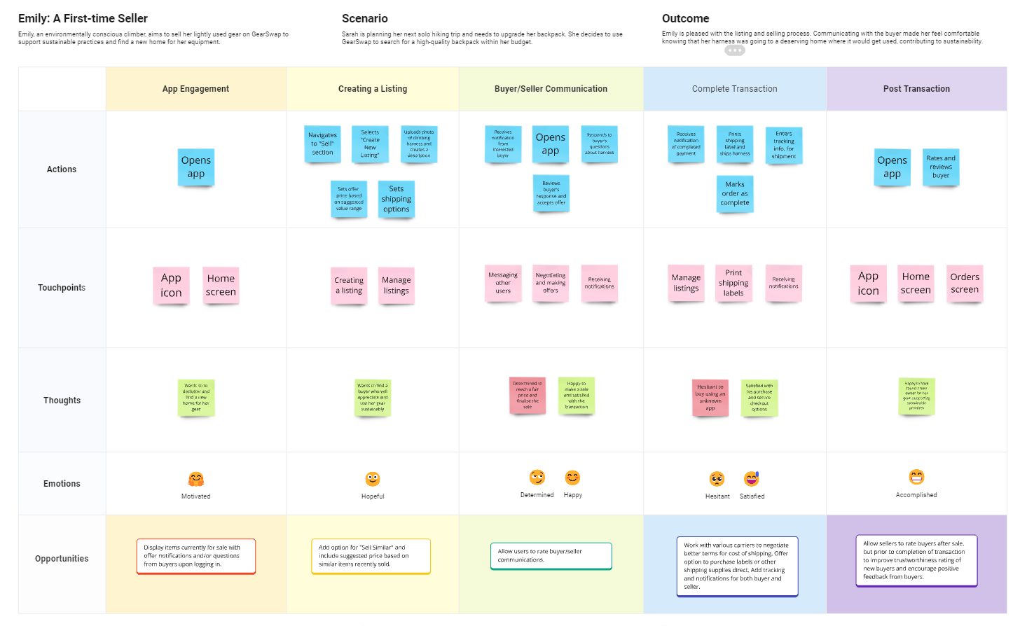
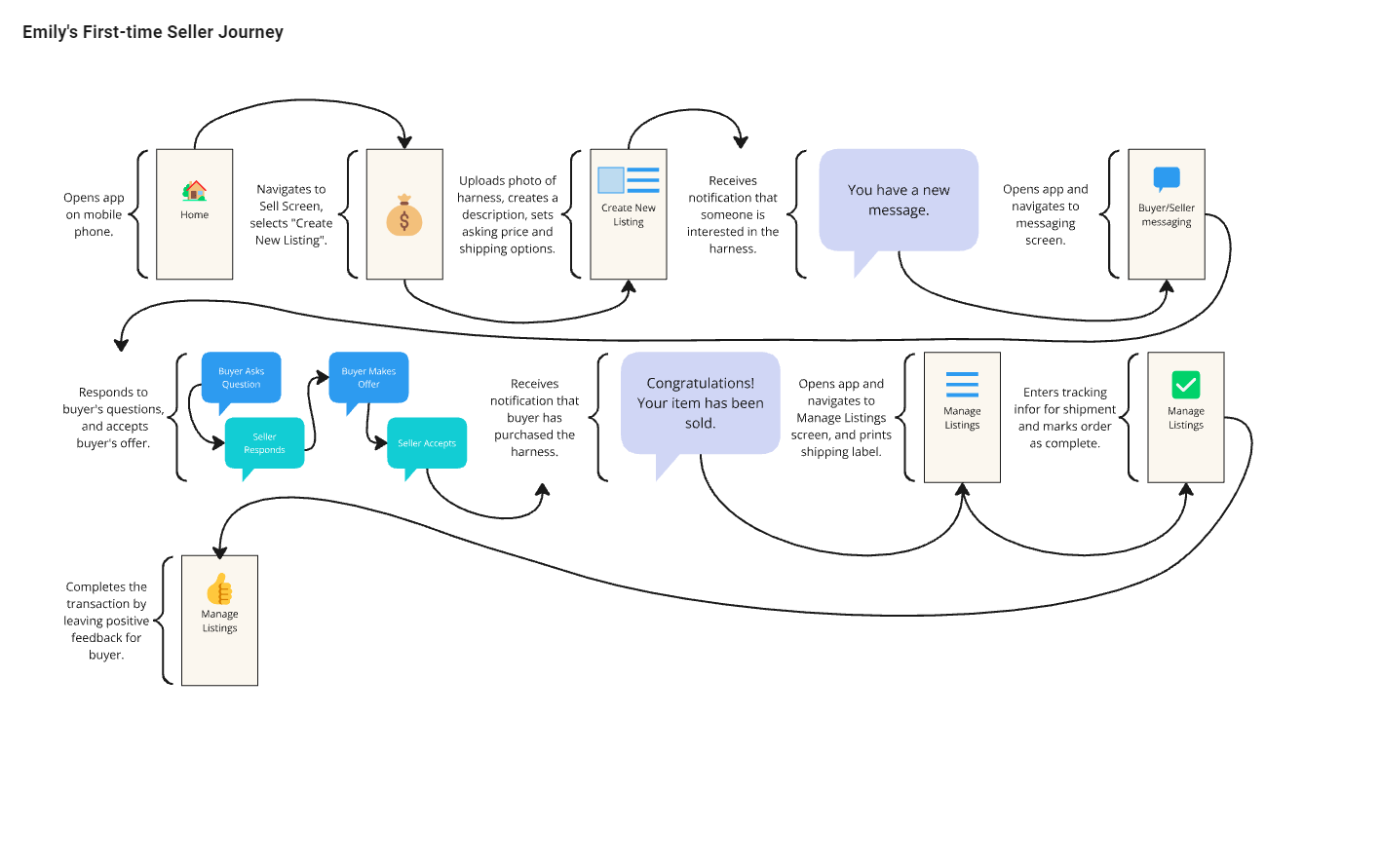
Journey Maps were created to further empathize with the Personas and to gain a deeper understanding of their motivations and expectations. Journey Maps help to personalize the user experience by highlighting potential friction points within the users' journey and point out opportunities for improving the experience.
Market Research
The first thing I wanted to do was to look at the competition to identify gaps in the market. To accomplish this, I looked at the types of services and features available on existing platforms that people may use to buy or sell used gear. Drawing from personal experience and conversations with fellow outdoor enthusiasts, I compiled the following list of websites to use as the foundation of my research:






Competitive Analysis
Out of all the competitors, only Ebay and Sidelineswap offer a mobile alternative for users who want to sell their used gear. Additionally, they are currently the only platforms that allow buyers to make offers on items, as well as being the only platforms to facilitate peer-to-peer communication between the buyer and seller.
While the other companies all specialize in outdoor gear, both Ebay and Sidelineswap serve a broader customer base. Sidelineswap concentrates on sports equipment in general while Ebay offers an extensive range of products outside of sports and outdoors gear. This creates a void between the larger companies that facilitate peer-to-peer transactions but do not specialize in outdoor gear and those who specialize in outdoor gear but do not provide peer-to-peer transactions.
Design Planning
Feature Prioritization
By this time, the core features required to help users accomplish their goals within the app have become clear. This list was refined over time by removing any feature that was not essential to the app’s functionality.
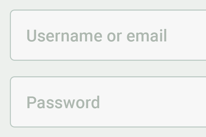
User Registration and Authentication
Users should be able to create accounts, log in securely, and manage their profiles. This feature is essential for facilitating transactions, communication, and trust-building within the community.
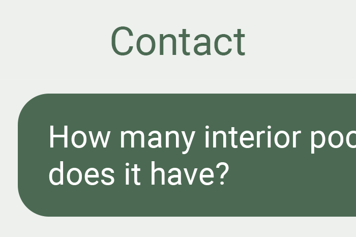
Messaging and Communication
Messaging functionality that allows users to communicate with each other to negotiate prices, arrange rental terms, and ask questions about listings facilitates interaction and transactional communication between buyers and sellers.

Listing Creation
Sellers should be able to easily create listings for their outdoor gear, including photos, descriptions, and rental availability. This feature enables the core functionality of the app – facilitating the buying, selling, and trading of outdoor gear.
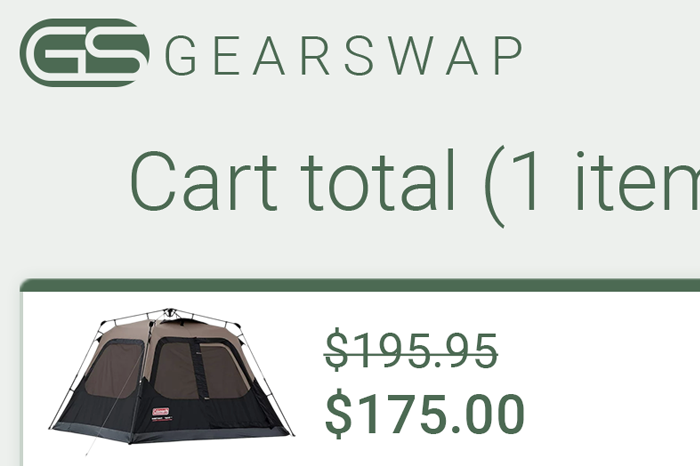
Secure Payment Processing
Implementing secure payment processing is crucial for facilitating transactions within the app. Users should be able to make payments securely using credit/debit cards, digital wallets, or other payment methods supported by the platform.

Search and Filtering
Users should be able to search for gear based on criteria such as activity type, location, brand, and availability. Advanced filtering options enhance the user experience and help users find relevant listings quickly.
Rating and Review System
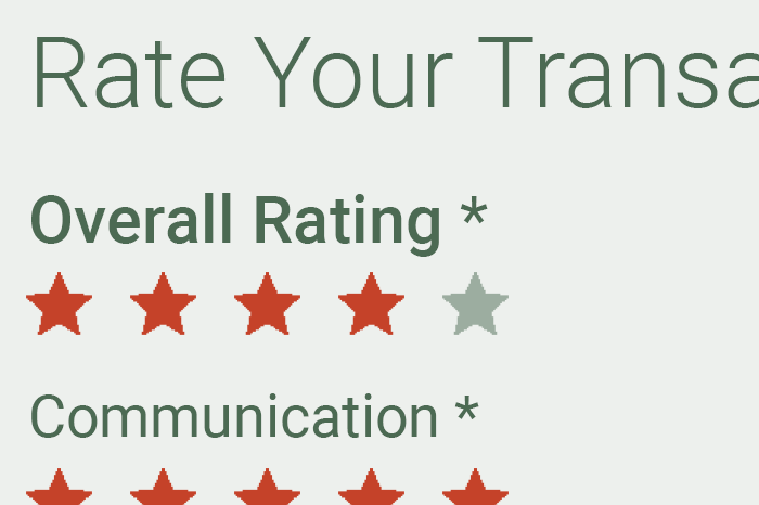
A rating and review system allows users to provide feedback on their transactions and experiences with other users. This feature builds trust and transparency within the community and helps users make informed decisions.
User Flows
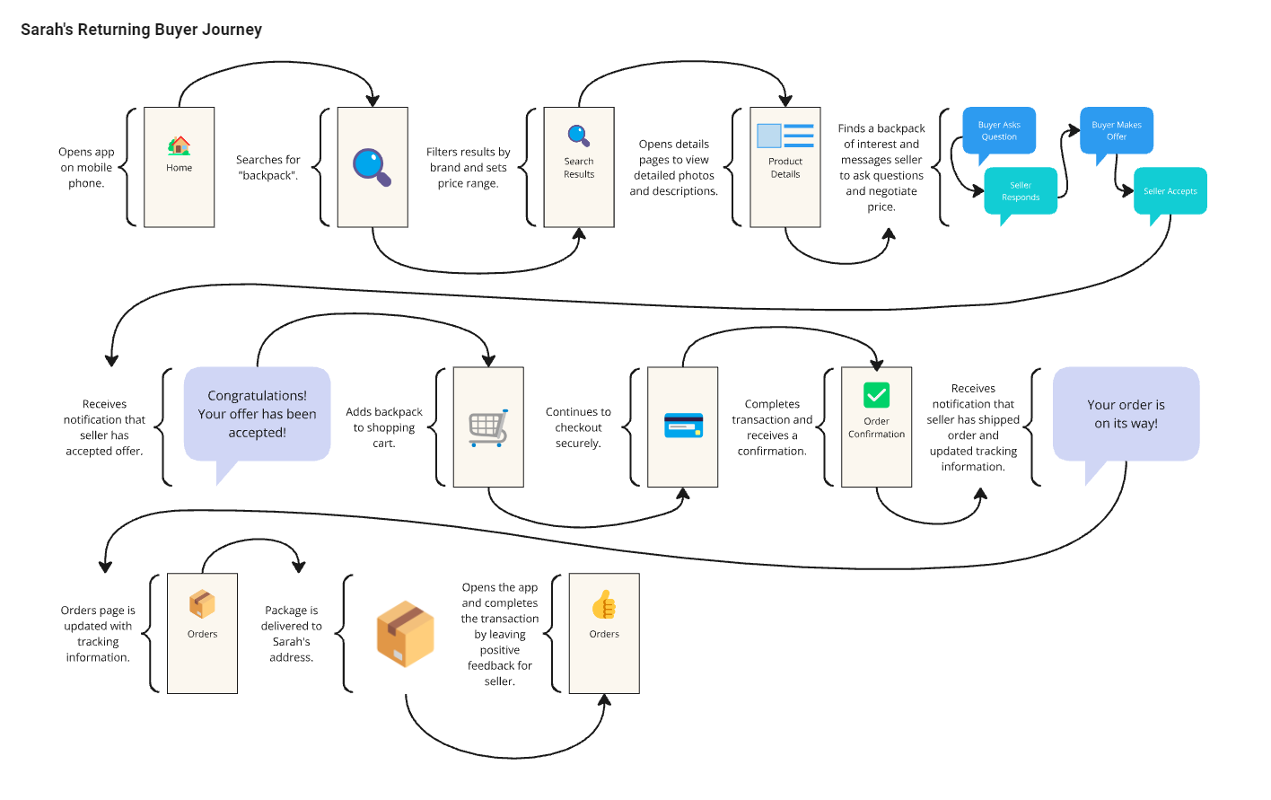
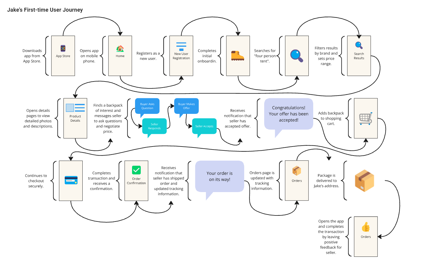
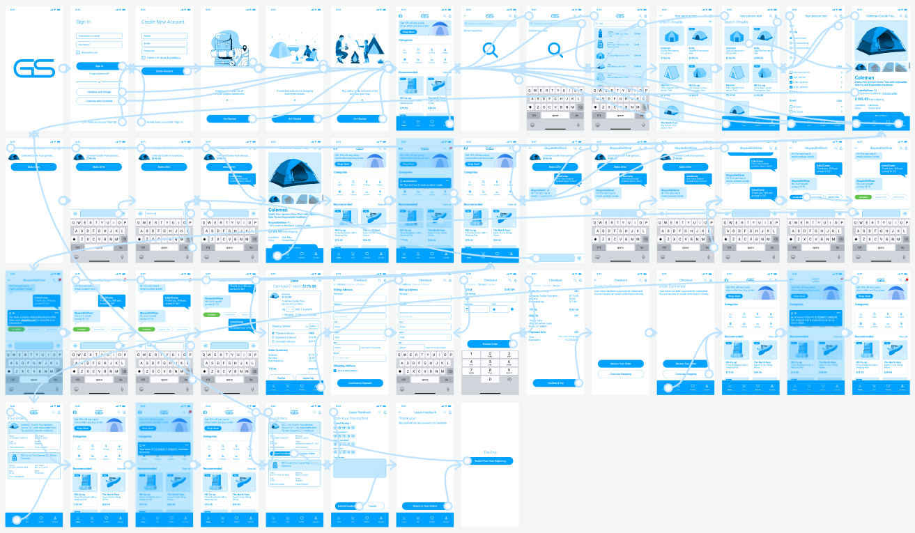
To get a more comprehensive view of how a user might interact with the app, I created User Flow diagrams based on the individual goals of each persona. Each User Flow outlines a path, or series of tasks, that a user might follow to accomplish his or her goals. The diagrams allow for the visualization of various decision points and system interactions that may arise during their journey.
User Interface Design
Wireframing
The next stage of design involved laying out the user interface for each of the previously identified screens. To accomplish this, I chose to work with medium fidelity wireframes, which allow me to focus on the layout of the app’s UI without getting caught up in details like colors and imagery.
Prototyping
With wireframe layouts in place for each of the primary screens, I chose to develop a low-fidelity prototype using Figma that focuses on essential interactions. My goal with this prototype was to create a basic model of the messaging and negotiation feature that could be presented to users for quick feedback on interaction touchpoints and the general flow of the system. Take the prototype for a spin.
Visual Design
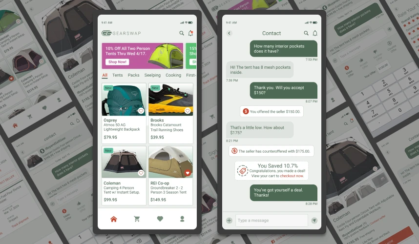
At this point in the project, I have developed a strong understanding of how the app should look and feel to the user. The underlying structure of the user interface has been defined in detail, including the general size and spacing of various elements such as buttons, icons, and form fields. Visual Design involves deciding how the final product will look and laying out essential components and screens in pixel-perfect form.

Logo and Wordmark
I used a basic geometric shape with knockout lettering for the logo to give it a crisp, modern look. It's simplicity makes it extremely versatile and well-suited for use as an app icon.

Color Palette
Sticking with the theme of simplicity, the color palette has a soft, earthy feel with a forest green primary color set against a muted gray back drop with firebrick red and peppermint highlights.
Typography
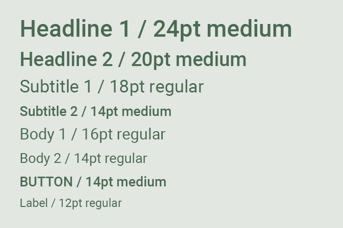
To ensure consistency within the UI, Roboto serves as primary font face of choice with sizes ranging from 12pt to 24pt and weights including regular and medium.
